how to hang a gallery wall
Back in January I did a post on my love for gallery walls (you can read that here). I subsequently received an email from a reader asking me how to go about hanging a gallery wall, so I thought I’d share my response with you.
Dayna,
I really enjoyed your post on gallery walls and I have a couple of questions on the do’s and don’ts of a putting together a gallery wall. We recently received a sketch of our baby boy, which we will have framed. I was thinking of putting together a gallery wall around the sketch. Can you do a gallery wall with family pictures or is it better with more abstract art? Should there be a theme to the pictures/art pieces or does anything go? I noticed you lined up your frames so that the whole thing is symmetrical. Are there any “rules” around how to put the pieces together? Thanks in advance for your advice. – S.
Well, the short answer is – there are no rules. Sorry! Can you use family photographs? Yes. Should you use abstract art? Sure. Can you mix family photographs and art? Of course. There are so many different styles gallery walls, it really boils down to your own personal style, what you are working with, and where you are hanging your gallery.
A traditional approach to the gallery wall is a collection of family photos. Classic. Here are a few examples:
Notice in the example above, the grouping is centered along two horizontal parallel lines. These act as guidelines for hanging the pictures above and below. The frames are all different sizes but the common colour (black) gives it a unified look. The example below follows similar guidelines, but since all the frames are the same width and the resulting look is a little more grid-like.
On the opposite end of the spectrum is the gallery wall where anything goes – mixed media, mixed frames, mixed sizes. This also works. To hang this type of gallery wall, I would suggest you start by deciding where you want your largest pieces to hang, then work around them (remember, the largest piece does not have to go in the centre!)
A great alternative to the gallery wall is a photo ledge (or multiple ledges). A photo ledge is less committal since you can switch up your art any time and you won’t make multiple holes in your wall. Space-wise, a ledge or two can be a great addition in a small space, such as a nook in the kitchen or in an entryway.
A few additional tips on gallery walls:
- A quick way to plot out your gallery on the wall: trace your frames onto paper then tape these silhouettes up on your wall with masking tape; move them around until you are happy with the layout, then get hanging
- For a step-by-step to hanging a gallery wall, check out the instructions over at Brooklyn Limestone
- Ikea is a great place to purchase frames for a gallery wall. Multiple sizes in each collection, inexpensive and you can switch out your art whenever you feel like a change
- If you have old frames hanging around the house, consider freshening them up with a new coat of paint
- Don’t stick to photographs and art, you can also frame sentimental objects in a shadow box
- If you need a punch of colour or pattern, consider framing a swatch of fabric or a decorative piece of paper (scrapbook paper works great)
- If you need to supplement your current collection, Etsy is an amazing source for unique, handmade, or personalized artwork. And much of it is inexpensive!
(images: 1-made by girl, 2- pure style home, 3-house to home, 4-martha stewart, 5-decor8 , 6-hgtv, 7-ivillage, 8-design crisis, 9-the creative mama , 10-west elm, 11-me)
[room of the week] a Victorian in Melbourne
I love Victorian row houses, especially in my beloved Summerhill neighbourhood. But it can be really tough to decide where to place your furniture in those narrow spaces. Here is a casual but elegant living room by a couple of talented gals in Melbourne Australia. Placing a chaise where one room flows into the next is a great way to provide additional seating but maintain a visual sight line into the next living space.
(image: gardener & marks)
[diy] “where did I come from?” map
Ok, so to be upfront (in case you are looking for real advice), I’m not helping you answer the REAL “where did I come from?” question. Ha! I have a few more years before my son starts asking about that. Rather, I am sharing a little project I did for my son’s room, showing where exactly he came from – on the map. And since I’m being honest, I should also say that I am not a real DIY’er. It is more of something I admire from afar. Not that I don’t appreciate the skill, creativity, and perseverance of DIY’ers, I do! I follow a number of DIY blogs on a daily basis (especially home reno ones), it’s just that I just don’t have the time, nor space. So this project is an exception.
Here are a few images that inspired this project….
As a child, my sister and I had a huge map book and we would pore over it for hours, quizzing each other on all the American capitals (funny enough, I don’t remember looking at Canada). Maps are cool. And a great learning tool.
Since I didn’t want to spend a whole lot of cash on a giant map or wallpaper, my map project is scaled down in size. Anyway, isn’t saving $$ a major goal of DIY? I already had an IKEA RIBBA frame (16″x20″) that was sitting around and while I was making an Etsy purchase for something else, I noticed this shop also sold vintage maps of Canada for only $5.00. Score. $5.00 was the total cost of my project!
To give some real meaning to this project, I decided to use only maps that had meaning to our little family. I made a collage using the whole map of Canada, the map of Alberta (where my man was born), the map of Ontario (where my son and I were born), and a snapshot of Montreal (where my man and I met in University).
20 minutes later I was done. Easy! DIY is not so bad after all.
What do we think?
Now, if you aren’t into DIY but you’d like to add a small map to your child’s room, I would highly recommend checking out the Montreal-based Etsy shop English Muffin Prints & Posters.
Or if you want to go big, you could always pick up this large canvas from IKEA (78.74″x55″).
I’m not quite ready to debut the photos of my son’s room but stay tuned. For now, you can check out my inspiration board here.
(images: 1-lonny, 2-cox&cox, 3-kids room decor, 4- remodelista, 5&6-me, 7-english muffin)
[homework] top trends of 2011 – the new global
“Subtle and tailored” is the way Canadian House & Home described the “New Global” trend for 2011. Moving away from the wildly eclectic decor we’ve seen in the past, we are going to see a more elegant approach to the look.
You can channel Moroccan vibes with items like carved screens, perforated-metal lanterns and leather poufs. Leggy chairs, African artwork, natural woods, and Asian-inspired furniture can be combined with subtle accents to achieve today’s contemporary global decor.
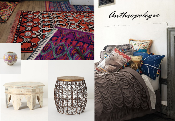
Here is my take on the look…
For those who may not have the luxury of globe-trotting to amass worldly items, you could make a trip over to Anthropologie (in person or online) to buy yourself some exotic decor. They have a number of great ethnic-inspired lines this season, including really gorgeous bedding and rugs.
This concludes my five part interpretation of H&H’s Top Trends of 2011. Let’s sit back and see how the predictions play out….
RELATED POSTS:
You can read my first four posts on the Top Trends of 2011 here: the new modern, the new vintage, the new country, and the new traditional.
(images: 1-made by girl, 2-houzz , 3-katie leeds , 4-desire to inspire , 5-me, 6-Anthropologie)
lush design love
Happy Valentine’s Day to one and all. Don’t you LOVE these pillowcases?
Speaking of LOVE, I have to tell you about this lovely little store in London (UK). Ok, since my Mom reads my blog, I should ‘fess up and say that she found this store online then showed it to me. A truly great find. Lush Designs is located in Greenwich, where my sister is currently living, so I’m hoping she’ll read this post and bring me back a little something. *wink *wink
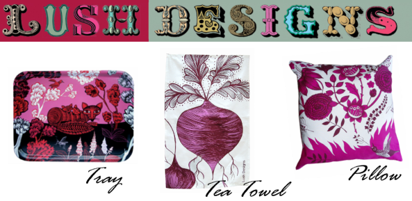
Here is just a selection of their whimsical, playful, vibrant products…
How cute is this tableware set?
And these greeting cards?! Fantastic. They come in sets of six and I definitely want a set. Or two. Pop them into frames and ta-da you have yourself a fabulous little art collection! I may have to go visit London just to get some. Err, I mean go visit my sister and while I am there, stop in.
I highly encourage you to pop over to their site to look at the entire Lush Designs collection. Definitely check out the lampshades while you are there!
(images: all lush designs)
[room of the week] by Joe Schmelzer
I can’t decide what I like the best -the clerestory windows, the gallery wall, the Eames chairs, the openness, the airiness, or the combination of wood, chrome, and white. In any case, I’d like to be invited over for lunch! Next week perhaps? For more oooing and ahhhing, check out the photographer’s website: Joe Schmelzer Inc.
In case you missed it, last week’s Room of the Week was this darling floral nursery.
(image: joe schmelzer via desire to inspire)
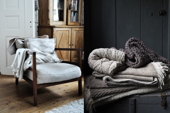
Grey. Wool. Wood. Velvet. Texture.
I think the grey skies of winter have swayed my choices of late. I’ve been drawn to woolly, woody, and velvety textures in natural colours but especially grey.
If you are feeling the same way, here are a few suggestions from local retailers.
West Elm – not so hard on the budget, on-trend designs:
Restoration Hardware – creeping up the $ scale but classic, quality designs:
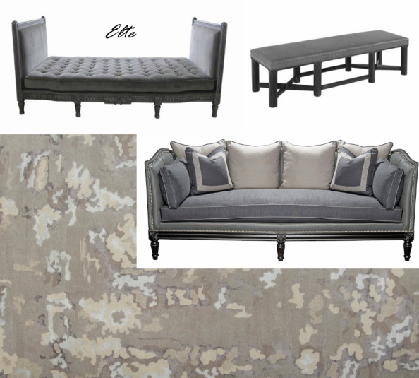
ELTE – high-end designs in all styles, available to the trade (contact your designer or me!):
(images 1-solid frog , 2-greige , 3-little plastic horses, 4-flickr, 5-greige , 6-moncer, 7-West Elm, 8-Restoration Hardware, 9-Elte)
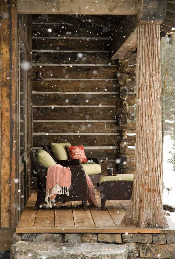
It’s snowing….
I really do love winter. Especially when I can stay home and watch the snow fall outside my windows. But then again, I’d also love to be sitting slope side.

Stay warm!
(images: 1-log home, 2-franciskas vakre verden)
[homework] top trends of 2011 – the new traditional
I’m a little behind schedule, but here is the fourth installment of my take on Canadian House & Home‘s top trends of 2011. This week I am looking at the “New Traditional” which is a bit of a buzz word in the design world these days. According to the Editors at H&H, traditionalists are infusing more colour, drama, and bold patterns into their interiors. Recommended means of achieving this look are chinoiserie wallpaper and exotic brights which could work in any room, and camp-style blankets and upholstered headboards with nailhead trim in the bedroom.
(images: 1- Massucco Warner Miller, Ngoc Minh Ngo)
Here is my take on the look….
While we are on the subject of “new traditional”, I want to mention how much I love an upholstered headboard with nailhead detailing. It is sophisticated with a bit of edge. It is traditional with an air of modernity. A curved headboard can be grounded with this slightly masculine detail. You can find some of these great heaboards at regular retail shops such as Restoration Hardware or West Elm, a custom version through your designer, or try your hand at a little DIY. 
(image 1-Restoration Hardware, 2-West Elm)
RELATED POSTS:
You can read my first three posts on the Top Trends of 2011 here: the new modern , the new vintage, and the new country.
changin’ it up
I wasn’t totally feeling my original layout, so I made a change to the set-up of the blog. I think it’s easier to read now…?
Hope you like it!
nursery for a baby girl
A couple weeks ago I shared a nursery design board I made for a recent project. Today I am pleased to show you some photos of the finished room! Initially, the design of this nursery was gender neutral. My clients didn’t know whether they were having a baby girl or baby boy, so the main elements chosen would suit either gender. The starting point was the artwork, which I found via the nursery of a friend.
{How darling are those little babies? A wee girl AND boy!}
So with this colourful and modern piece of art chosen, we decided to keep the pale blue colour in the office (now nursery), which we had originally chosen several years back when my client moved into their home.
As for the furniture, we went with solid hardwood made by College here in Canada (though rumour has it some of their lines will soon be coming from China). Some good features of this line are (1) the dresser/changer can be used for years down the road since once the change pad is removed, it simply looks like a great modern bedroom piece, (2) the dresser has tons of storage, and (3) the crib converts to a double bed. Tip – when selecting furniture and accessories for your nursery, consider that your newborn won’t be an infant for long! Think long-term and select pieces that can grow with your child.
Although this room started out as gender neutral, I had a few errands to run once the baby (girl!) was born. I accessorized with a few hits of pink (rug, pillows, etc.) that can be taken into her big girl room once the nursery is needed for the ‘next one’. No pressure guys.
Just kidding. This wasn’t their office. But I did a very bad thing and forgot to take a “Before” shot. You get the point – it used to be a home office and now it is this serene nursery….
Sources:
1. Crib & dresser, Offspring by College, available at baby retailers across Canada
2. Glider, Dutalier, available at baby retailers across Canada
3. Side table, Martini by West Elm
4. Shelves, Ekby by IKEA
5. Artwork, Birds in a Tree by Dwell Studio, available at baby retailers across Canada
6. Pendant, BLVD Interiors
7. Mirrors, DeSerres
8. Rug, custom, available at baby retailers across Canada
9. Toy bag, Three Sprouts, available at baby retailers across Canada
10. Accessories, most from Home Sense
(images: 1-Short & Sweet Photography, all others by me)
[room of the week] floral nursery
This week’s Room of the Week is a darling little nursery in NYC. Featured in the latest issue of the oh-so-fabulous RUE magazine, Nicole Cohen of Sketch42 is the designer (and mum) behind this lovely space. (You should also check out the rest of her home!)
I really like how feminine (but not babyish) and contemporary the space feels thanks to the combination of the traditional floral wallpaper and the modern streamlined furniture. I am also drawn to the small painting of the two little girls on the feature wall, it reminds me of the fabled Anne & Diana (yes, of Green Gables), though I know the blond should be a brunette. And how about that mini Philippe Starck ghost chair? How cute is that? Overall, this truly sweet space will grow along with the lucky little occupant.
(images: Nicole Cohen)
IDS 2011: overwhelmingly wonderful
Let me just start by saying the Interior Design Show was wonderful. And overwhelming. I started with an initial walk-through to check out the lay of the land and to see what this year’s show had to offer. Then I ate a granola bar, listened to a panel discussion, used the washroom, took a big breath, and then back-tracked through all the exhibits. In all fairness, I think I needed to do a third and fourth walk-through to do all the exhibitors justice. But as I said, I was overwhelmed with all the amazing furniture, finishes, designers, and products represented. Now, if I or one of my clients was in the market for a high end kitchen with fancy-schmancy appliances, or a luxe bathroom with an uber-cool tub and hardware, I would have spent a lot more time looking at some of the fantastic new products on the market. However, that was not the case. I was just there to take it all in and get inspired. And inspired I was.
The Studio North portion of the show was my favourite (Studio North = representation of forward-thinking, edgy Canadian Design from right across the country). Here is a round up of my favourite exhibitors….
Jean Willoughby is aToronto-based furniture and product designer is driven by a philosophy I appreciate and gravitate towards: purposeful, practical, functional, strong lines, and timeless neutrality. This curved concrete and wood side table was on display on the prototypes stage. It was very cool. Yet warm. Loved the wood and concrete combo.
Textile designer Julie Moschenross is the creator behind the Manor 12 line. Each piece is hand printed and made here in Toronto. I loved the colours, patterns, and textures of the quilts and pillows on display. Comfort, quality, and beauty.
Earlier this week I was introduced to the Carroll Street Woodworkers by a great post over on the marion house book so I was excited to see them at IDS. Let me tell you, this booth was packed everytime I walked by (I walked by three times because I really loved their turned wood light fixture and had to check it out from all angles). This desk is pretty darn cool too- cords run down the leg and quirky little buttons pop out to reveal hidden storage compartments for your pens.
My day job has nothing to do with design. At all. When I am is my design groove I care not to think about “work” at all. But I had to smile when I saw the designs of Nicole Tarasick today. My client is a major Canadian airline and I’m accustomed to referring to the major Canadian cities by their airport code (Toronto=YYZ , Montreal=YUL, Vancouver=YVR, etc). Nicole’s mission is to handcraft textile goods with bold design, patriotic content and a minimal environmental footprint. Even though I don’t want to think about work when I am at home, I am thinking about purchasing one of her graphic pillows through her Etsy shop. They are just so Canadian. I dig that.
This coffee table/dinette by TILT is an example of great design. Seriously. Hey teeny tiny condo owners, here’s a space-saving solution for you!
Montreal-based TOMA offers up everyday objects designed to infuse a little humour and whimsy into the hum-drum of daily living. How about this boot mat? It’s 100x better than my Canadian Tire special. And offered at a very decent price at that ($45CDN). I also adore their hangars – designed to hold your coat and scarf at once. Or better yet, just leave them hanging empty because their whimsical shape is just so pretty!
I’ll wrap this post up by declaring my delight about the Sarah & Theo Richardson “Sibling Revelry” space. I will admit I wasn’t a huge fan of the red-themed dining space but I was over-the-top-pleased that the main feature of the room was the same Holzberg Summerhill print I have hanging in my foyer. Yay me.
[room of the week] velvet, silk, and emerald
As evidenced by the red carpet at the Golden Globes, rich and luxurious emerald green is in.
via NY Daily News
My choice for Room of the Week echoes the classic glamour donned by the leading ladies of Hollywood. Designed by Tazmin Greenhill, this divine room is full of rich fabrics, warm antique touches, an elegant palette, and art-deco-inspired touches. How welcoming is that lush velvet sofa? And how lovely is the patina of the mirrored wall surrounding the fireplace?
via Tazmin Greenhill via The Nero Chronicles
loving the gallery wall
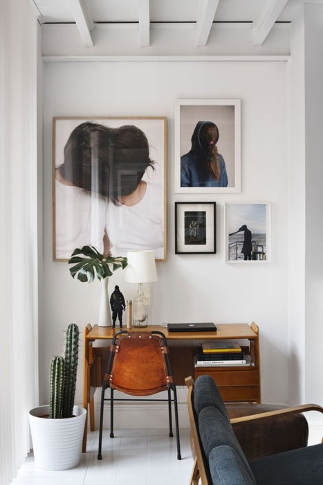
Gallery walls are everywhere and I am loving them. A gallery wall is such an efficient use of a small space (or you can go nuts in a large space) and it is a great way to pull together a mix of your favourite pieces of art. Here are a couple gorgeous examples….
via photo problem
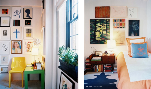
And here are a couple more fun and vibrant examples…
via lonnymag
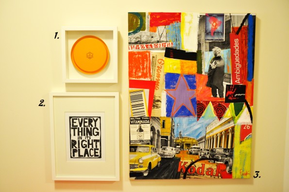
Having recently moved into a new space, the biggest challenge has been deciding which pieces of art I’d like to hang. We are currently renting and plan on staying for no more than 18 months so I don’t want to make too many gaping holes in the walls. But at the same time, I am intent on making the space ‘ours’. As such, I decided to do a small gallery wall in our foyer with a few favourite pieces that would add a punch of welcoming colour. On a related subject, I should mention that I am a big proponent that every piece of art you own should have some personal meaning. It doesn’t need to be expensive by any means, but whether it is a photograph you’ve taken, a postcard from an old friend, or a print you’ve picked up on vacation, the art you hang on your walls should have some special meaning or story for you. Without further ado, here is our new gallery wall (please excuse the absence of any other accessories…that is another work in progress).
1. Four years ago my man and I went to Paris for 10 amazing days. During that time we left the city for two days to visit Reims and the Champagne region. One of our favourite champagne houses was Veuve Cliquot Ponsardin. We brought home several bottles of VCP including their ‘Paint Tin’ collection of four mini bottles. I re-purposed that tin two ways: (1) I framed the lid as shown here and(2) I potted a fern in the base of the can. Long after the champagne was gone, this souvenir just keeps getting better!
2. I am addicted to Etsy. I really love a lot of the typography and graphic prints being made right now. I came across this print and knew that my man would be pleased with it (he is a huge Radiohead fan) and I will admit that I love the literal meaning (I am a bit of a neat freak).
3. I picked up this mixed-media collage in Havana a couple years ago when I was visiting Cuba with my Mom. The colours are so vibrant and it really captures the vibe Havana today (which is certain to drastically change in the near future).
So there is our gallery and why I chose the pieces I did.
We also have a Ben Mark Holzberg print hanging on an adjacent wall. I posted about that here.


